Wednesday, July 27, 2005

Australian Design: OZ GRAPHIX 5

Browsing at Barns & Noble a couple weeks back I picked up OZ GRAPHIX 5. Strictly on an eye candy level, it was really impressive. Yesterday I went back and bought it. It was worth the 24 bucks.


I've been a subscriber to Communication Arts, and on so many levels I find it better than any other design journal. The articles, the ideas, the motivation it gives me to up my game, etc... Other reads like HOW and Print are ok sometimes, but they're disappointing often enough to not warrant laying down money for a yearly subscription. (Just my personal opinion of course)

Every now and then though, I'll go ahead and purchase an individual design publication if if they merit taking up space on the shelf. OZ GRAPHIX 5 definitely fits that category.

Tuesday, July 19, 2005

On being

I read a book not long ago about Corporate branding. Ok part of a book. It was well written, emphasizing corporate identity and branding over all else, and it was amazing how little the book spoke of other factors that mattered, ..as much.


A short article I ran across today provides an entirely different viewpoint. One closer to reality:

“The customer doesn’t have to be a design guru or connoisseur, therefore in all likelihood he wants something that he has already seen somewhere: “The N Corporation has a pretty logo, I want you to make something like that for me”. However, to make “something like that”, one needs to know at least why N made it this particular way, what it had in mind in the beginning and what sort of mistakes it had avoided.


Customers drooling at the BMW logo forms forget that their colors and position allude to the Bavarian flag, while the logo itself symbolizes an airplane propeller for engines that Bayerische Motorenwerke once built. This logo is only good as long as it is attached to good cars.

Good design, a highly recognizable emblem or a logo, an all but perfect corporate organization chart, consumers going ape at the sight of corporate identity elements are all the trappings of a company of good standing supplying quality products and services.

It’s not hard, really, for a company to get there: decades of painstaking work will make its design a worthy model for imitation. Borrowing the paraphernalia of a successful company will have an effect on business just as tangible as the contribution of gnawing at an athletics champion’s ankle to a victory in marathon.”


..In the same boat are organizations bent on gaming their Google ranking through all manner of strategies, hacks, and deceit, instead of simply building a site that people appreciate and want to link to. …The whole reason Google works in the first place.

New Ways to Work

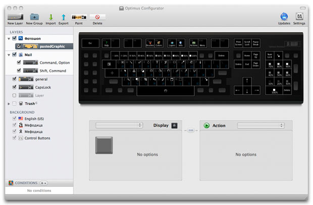
Yesterday we were all amazed at the idea of the Optimus keyboard, a keyboard in which "every key is a customizable stand-alone display showing exactly what it is controlling at this very moment." Imagine how cool that would be / will be - Alt tabbing from Illustrator to Photoshop and all the keys on your keyboard light up with different representational icons.

For Quake:


For Photoshop: (screw remembering all those shortcuts)


And today its the new Tactapad. Demo videos here


I've got a feeling that we'll be sitting around not too long in the future, laughing about using a mouse.

Friday, July 08, 2005

Stylin with CSS

I'm two pages into Charles Wyke-Smith’s Stylin’ With CSS: A Designer’s Guide and I can tell that this book is going to help me out a great deal.

I often sit around mentally arguing back and forth whether or not I need to be so technically savvy or not. Should I try harder to be more of a "developer" AND a better designer? Or should I just focus on design?

The first sentence on page four of the book says: "Like any artist, your ability to achieve your creative vision is governed by your technical abilities."

That is a very powerful idea, and for me it calms down the argument I have against becoming a code jockey. It will be important. I'm going to "get my learn on" with this book.

Wednesday, July 06, 2005

Jargon is Only the Beginning

On corporate use of the word "leverage"

A meticulously conducted survey taken in my living room shows that 99 percent of all uses of “leverage” stand in support of puffed-up marketing crap that makes its authors look like big dorks. Like “solution,” the word no longer carries any special bonus inflection, and bears the added disadvantage of sounding pretentious.

Also:
Solution: Meaningless, Self-Indulgent, Arrogant

Finally:
A Call to Arms

My Generation

Zeldman talks at length about his experiences judging the May 1st Reboot

"Maybe redesigning for the sake of redesigning is not enough: to communicate visually one must first have something to communicate about. Or maybe too many design schools are teaching students how to imitate successful styles instead of how to communicate visually.

..It wasn’t so much that the designers had contempt for their users as that they seemed never to have been taught to think about users at all. One gets the feeling that the web design curriculum at too many colleges and universities consists of little more than tips on how to use Flash to imitate sites that won awards five years ago."